Below you will find pages that contain the key word “DataViz”:
20. April 2026
Ubuntu's Popularity Over the Years

With the highly anticipated new release of Ubuntu due out later this week (26.04 LTS), it’s a good moment to review the landscape of Linux distributions and ask: “is it the right operating system for me?”
I have been using Linux Ubuntu as my primary operating system (OS) for more than 15 years and it’s fair to say, I’m hooked! My enjoyment of and productivity using Ubuntu goes far deeper than it’s free and it has a great window management, though these are key benefits.
27. June 2025
XKCD Finder
XKCD comics have become a cornerstone of internet culture, particularly in technical circles, with their witty takes on science, programming, and mathematics. However, finding the perfect XKCD for a particular topic or reference can be challenging - there are now over 3,000 comics in the archive, and traditional search methods rely heavily on exact keyword matches or remembering specific comic numbers.
This project explores how modern Natural Language Processing (NLP) techniques can be used to search XKCD comics semantically, understanding the underlying meaning rather than just matching keywords. By applying vector embeddings and Retrieval Augmented Generation (RAG) to comic descriptions, we can now perform a search based on concepts, themes, and abstract ideas.
6. March 2024
Heatmap Analysis

This is an article I wrote for Verv during their Seedrs fundraising campaign in March 2024. Link to article.
This January, we finished the installation of the first Verv Smart Isolator with our partner Nido, a Spanish heat pump provider. A Verv Smart Isolator was attached to an air-to-water heat pump and in less than a week, we provided actionable insights for the customer.
One of the tools that helps us understand the energy usage patterns is the energy-utilization heatmap. The heatmap visualizes the hourly energy consumption over different days (vertical axis) and times of day (horizontal axis). The intensity of colour - marked in the legend - represents the energy expenditure during each hour, with darker colours indicating higher usage.
27. August 2023
Parkrun Map
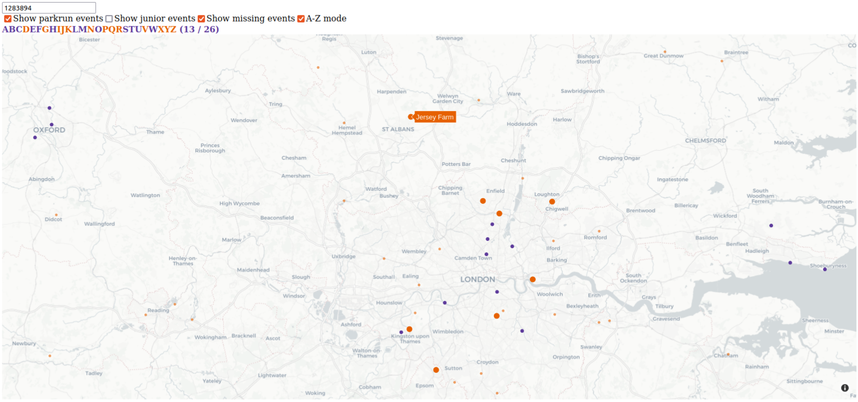
Like to parkrun? I certainly do! This project helps you to visualize where you’ve been running, and where you could go next. Simply run the app locally with Python, and enter an athlete ID (e.g. your own one).
I’ve used Plotly Dash to render the parkrun participation on a map for a given athlete. The map initially starts out centred on your home parkrun course - the one you’ve visited most - just zoom out if you’ve gone farther afield.